Next.js環境のHighchartsでlineチャートを作った
#Next.js
#Highcharts
#line
はじめに
実務でフロントエンドのタスクをいただき、初めてHighchartsを触りました。
思ったよりも簡単にデータをグラフ化できました。
セットアップ
まずは highcharts 、highcharts-react-official をインストールします。
$ yarn add highcharts highcharts-react-official
ディレクトリ構成
src/
  ├ components
  │  └ LineChart.tsx
  └ pages/
     └ lineChart.tsx
ソースコード
</>src/components/LineChart.tsx
import * as Highcharts from "highcharts";
import HighchartsReact from "highcharts-react-official";
import dayjs from "dayjs";

interface Sample {
  name: string;
  type: string;
  visible: boolean;
  data: {
    x: number;
    y: number;
    type: string;
  }[]
}

type Options = Highcharts.Options
type Props = { records: Sample[] };

export const getChartOptions = (records: Sample[]) => {
  const lineChartOpts: Options = {
    chart: {
      type: "line",
      zoomType: "x"
    },
    title: {
      text: ""
    },
    xAxis: {
      ordinal: false,
      type: "datetime",
      dateTimeLabelFormats: {
        millisecond: "%H:%M:%S.%L",
        second: "%H:%M:%S",
        minute: "%H:%M",
        hour: "%H:%M",
        day: "%m/%d",
        week: "%e. %B",
        month: "%b %y",
        year: "%Y"
      }
    },
    yAxis: {
      title: {
        text: "排斥本数",
        rotation: 270
      },
      opposite: false
    },
    tooltip: {
      formatter: function (this: any) {
        const options = this.point.options;
        let tooltipContent = `種別: ${options.type} <br />`;
        tooltipContent += `回数: ${options.y.toLocaleString()} <br />`;
        tooltipContent += `発生時刻: ${dayjs(options.x).format("YYYY-MM-DD HH:mm")} <br />`;
        return tooltipContent;
      }
    },
    time: { useUTC: false },
    credits: {enabled: false},
    series: records.map(record => {
      return {
        name: record.name,
        data: record.data,
        turboThreshold: 0,
        visible: record.visible
      };
    }) as Options["series"]
  };
  return { ...lineChartOpts };
};

const LineChart: React.FC<Props> = ({ records }: Props) => {
  return (
    <>
      <HighchartsReact highcharts={Highcharts} options={getChartOptions(records)} />
    </>
  );
};

export default LineChart;
</>src/pages/lineChart.tsx
import LineChart from "../components/LineChart";

const Chart: React.FC = () => {
  const sampleRecords = [
    {
      name: "サンプルA",
      type: "sampleA",
      visible: true,
      data: [
        {
          x: 1647877105000,
          y: 30,
          type: "sampleA"
        },
        {
          x: 1647913105000,
          y: 40,
          type: "sampleA"
        },
        {
          x: 1647927505000,
          y: 20,
          type: "sampleA"
        },
        {
          x: 1647959905000,
          y: 10,
          type: "sampleA"
        },
      ]
    },
    {
      name: "サンプルB",
      type: "sampleB",
      visible: false,
      data: [
        {
          x: 1647877105000,
          y: 10,
          type: "sampleB"
        },
        {
          x: 1647913105000,
          y: 5,
          type: "sampleB"
        },
        {
          x: 1647927505000,
          y: 20,
          type: "sampleB"
        },
        {
          x: 1647959905000,
          y: 30,
          type: "sampleB"
        },
      ]
    },
    {
      name: "サンプルC",
      type: "sampleC",
      visible: true,
      data: [
        {
          x: 1647877105000,
          y: 30,
          type: "sampleC"
        },
        {
          x: 1647913105000,
          y: 15,
          type: "sampleC"
        },
        {
          x: 1647927505000,
          y: 35,
          type: "sampleC"
        },
        {
          x: 1647959905000,
          y: 10,
          type: "sampleC"
        },
      ]
    }
  ];

  return (
    <>
      <LineChart records={sampleRecords} />
    </>
  );
};

export default Chart;
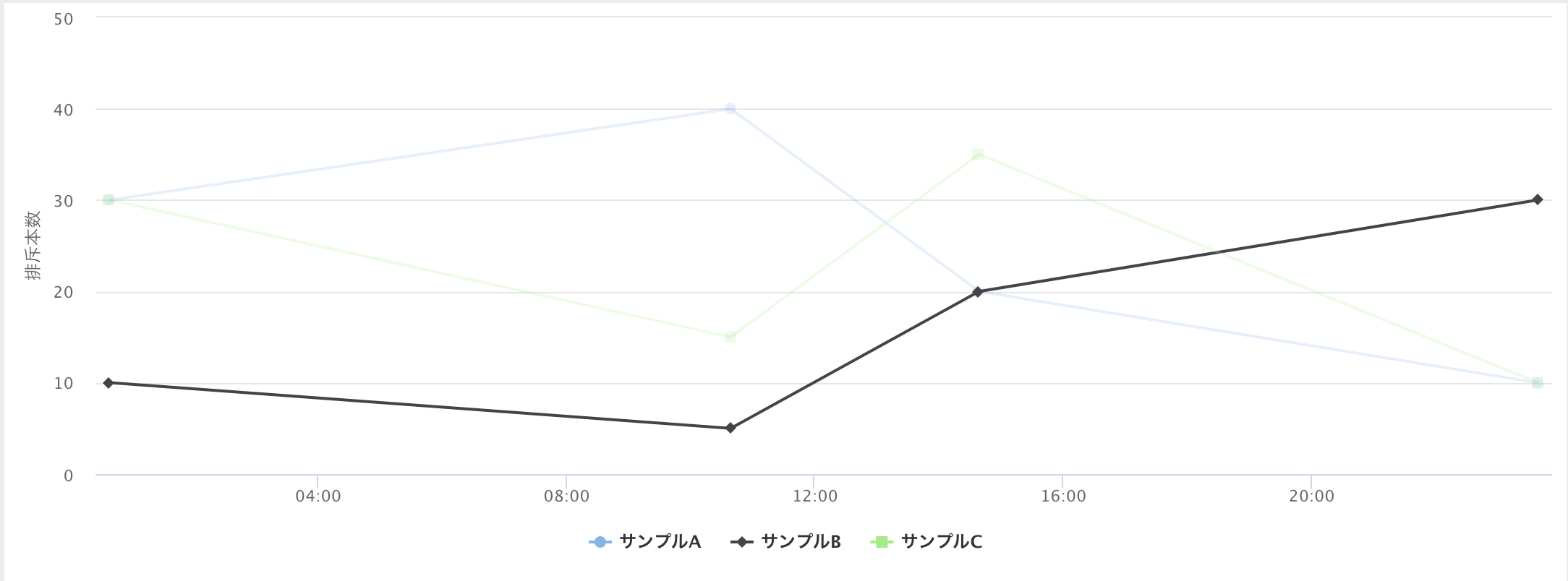
結果
画面を表示しました
サンプルBはvisibleをfalseに設定しているので不活性状態になっています。
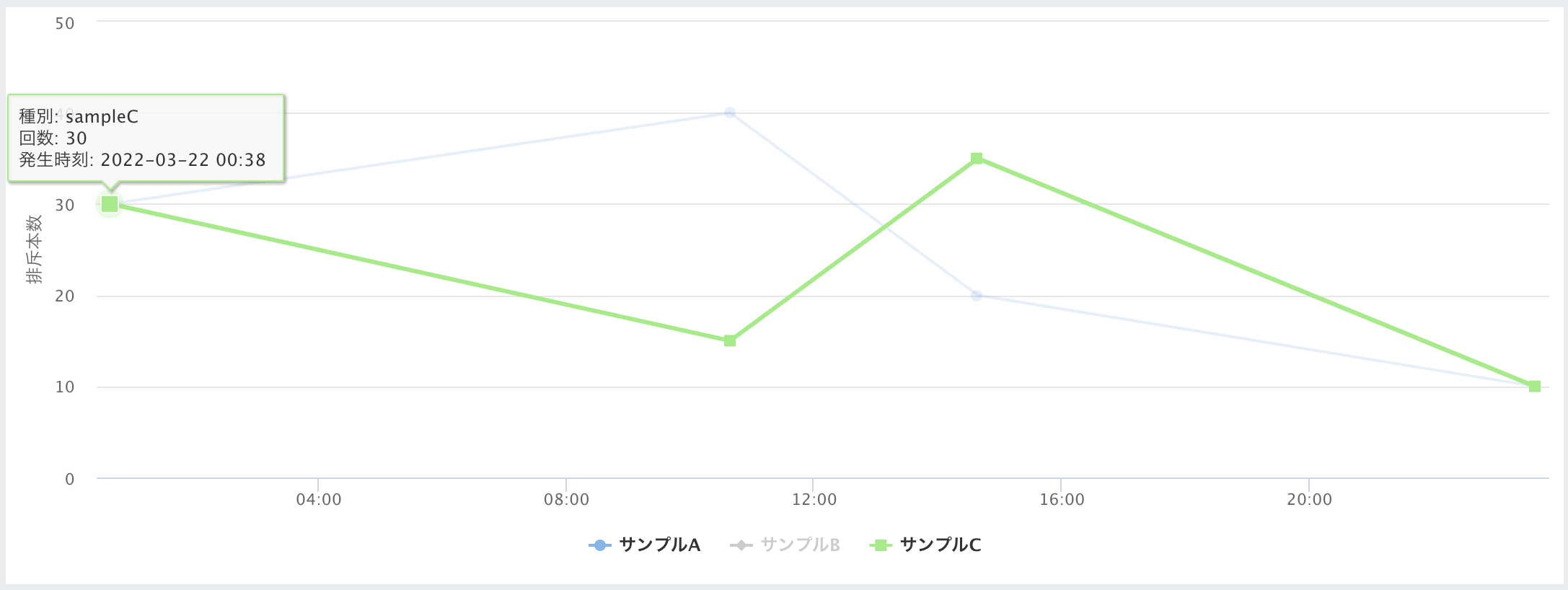
サンプルBをクリックすると活性化してチャートが追加されます。
プロパティについて少し解説
細かい設定は公式ホームページを参照してください。
=> https://www.highcharts.com/
今回は使用したプロパティのみ解説します。
chart
typeに"line"と設定することでラインチャートのグラフに変わります。
"pie"にすると円グラフになるなど使用用途に合わせて選択してください。
xAxis
横軸の表記設定です。
データによっていい感じに横軸の範囲を変えてくれますが、表示のフォーマットをdateTimeLabelFormatsで変更できます
yAxis
ラベルと角度を設定しています
tooltip
データのプロットをhoverした際に表示するフォーマットを設定できます。
this.point.optionsでプロットの情報を取得できます。
credits
falseに設定しないと"Highcharts.com"というロゴが表示されてしまいます。
series
ここにレコードのリストを投入します。
turboThresholdを0にしないと1000件以上をプロットを流し込むと表示できなくなります
visibleで初期表示時の活性・非活性を設定できます。